Building Trust Through Design Systems
Can we use visual design to build trust with our customers?
Context
Indigo, a marketplace for farmers, suffered from a user trust issue that presented a major business hurdle—agriculture is a relationship-heavy industry where people prefer to do handshake business instead of relying on software built by an east coast tech company. We heard from many customers that they viewed Indigo’s grain marketplace as “just another middleman”.
Indigo’s outdated visual design added to the distrust of farmers by creating an inconsistent and unpredictable experience for farmers.
When farmers are making multiple transactions the size of a typical mortgage, a strong first impression from the visual and interaction design goes a long way towards instilling trust.
Problem
Indigo’s products were built using an older and relatively out-of-the-box version of Google’s Material UI. The visual style was already aging, the interfaces looked like prototypes, and each team was making their own decisions about page layout without necessarily following the patterns of other feature teams inside the same experience. The result for the user was a product with small to major inconsistencies as they navigated between pages.
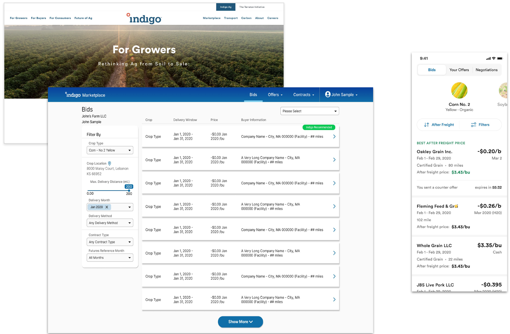
Internally, our marketing brand guidelines had evolved multiple times, but our product design system hadn’t kept up with those changes, and our web products didn’t look or behave like our public-facing website or the new iOS app we were rolling out to farmers.
Research
I conducted interviews with dozens of designers, engineers, product managers, both at the IC and leadership levels, to understand their impressions, successes, and the pain points they had experienced working with the design system. I used the feedback from those interviews to set the goals for this project.
Goals
- Create visual consistency with our brand guidelines, public marketing site, and new iOS app.
- Improve the first impression with our farmers to build trust.
- Lay the foundation for future component work by improving the tokens in the design system.
- Roll out this work to product teams in the most minimally-disruptive way possible.
Design Exploration
Since this work required a high-fidelity approach, I dove into Figma. I audited our products and grabbed existing design work from each product team that represented the different types of patterns and layouts we were using, and recreated pages that only had older Sketch design files.
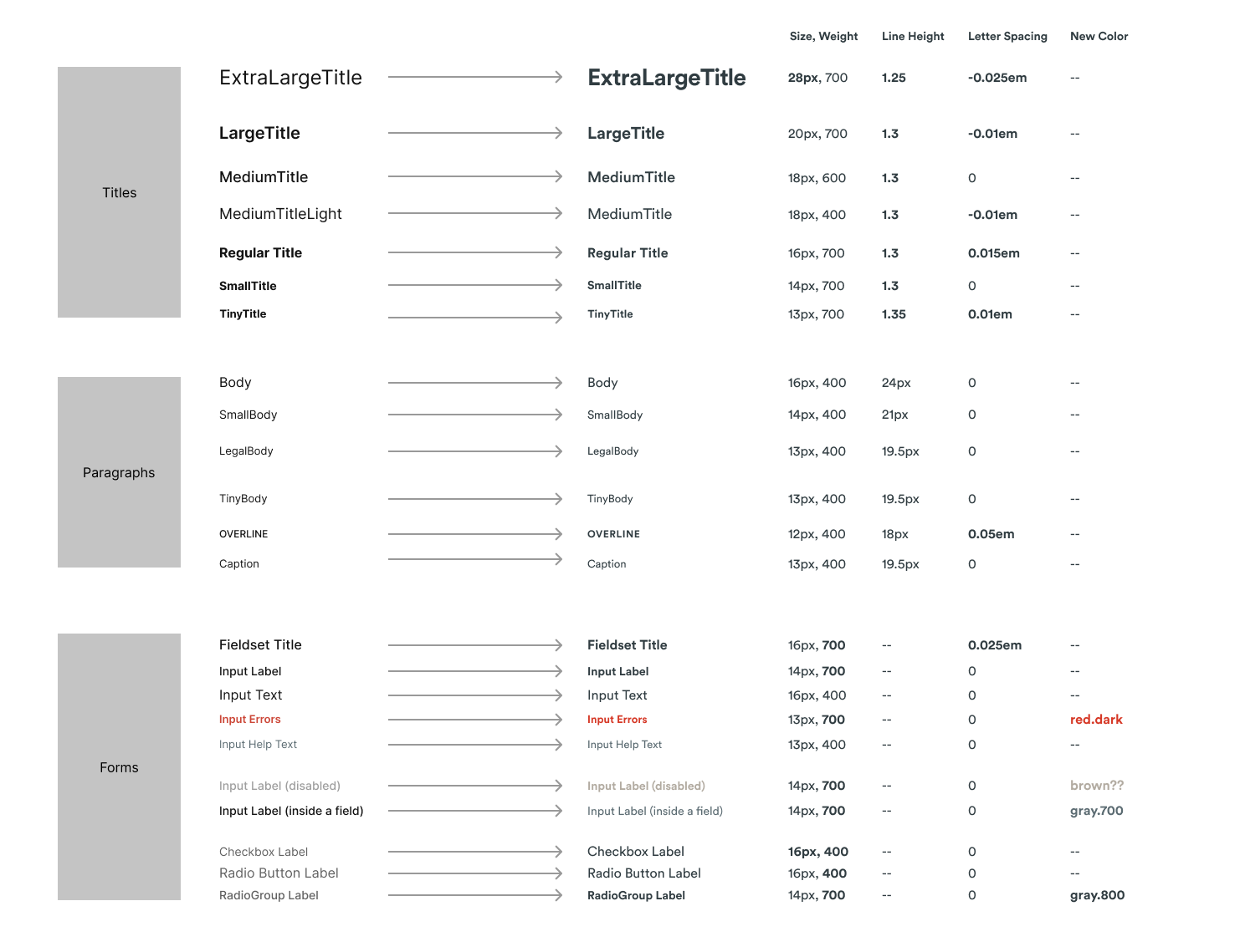
We were using Inter for a product typeface, and I explored replacing it with Circular from our brand guidelines. Many of the type styles we had were easy one-to-one replacements, but given circular has a shorter x-height and smaller glyphs, sizing and spacing needed adjustment. I also massaged values along the scale to give teams more hierarchy options, and updated our base font size from 14px to 16px to improve legibility.
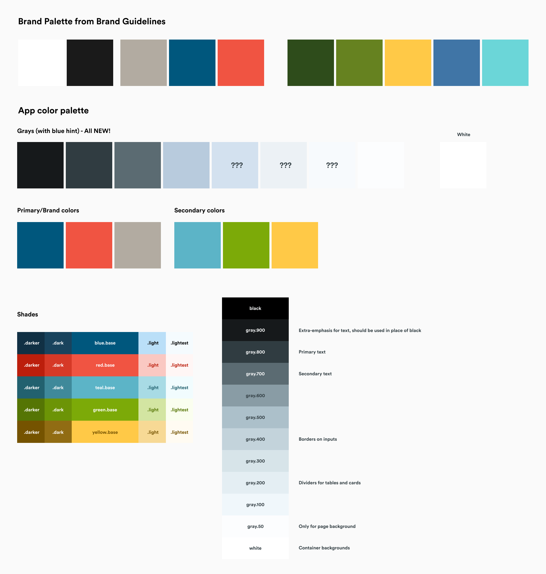
Primary and secondary colors were pulled in and I explored different ways to map them on color palette scales. After generating multiple scales and testing various combinations to see where we could standardize in our products and which pairs exceeded WCAG AA standards, we had final color scales.
Blue was our most important brand color, so I explored different ways to inject some personality and life into our flat gray scale we were using for borders, shadows, and background colors.
Armed with color, type, and shadow scales, and a sense of how to apply those to the page, we started designing new or updates to existing components to bring it all together.
Components
The bulk of our products were forms and tables, so I focused changes on those components first.
Buttons
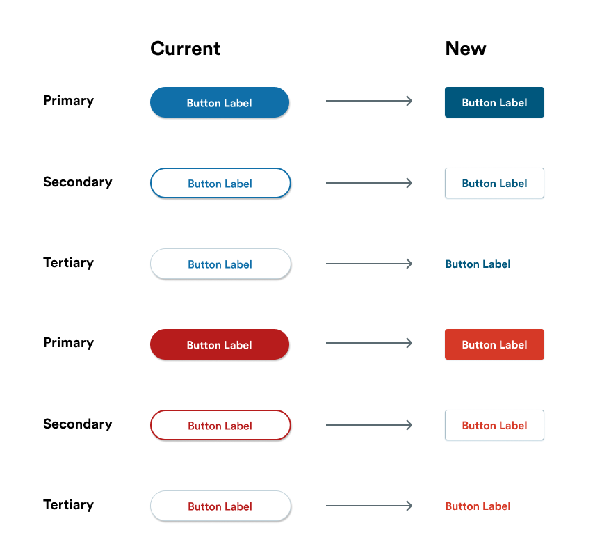
In my interviews with the team I’d heard anecdotes, and observed on customer session recordings, that buttons were often mistaken for tags (and vice versa) due to their similar pill shapes. I updated their shape and applied the colors to each of the different variants.
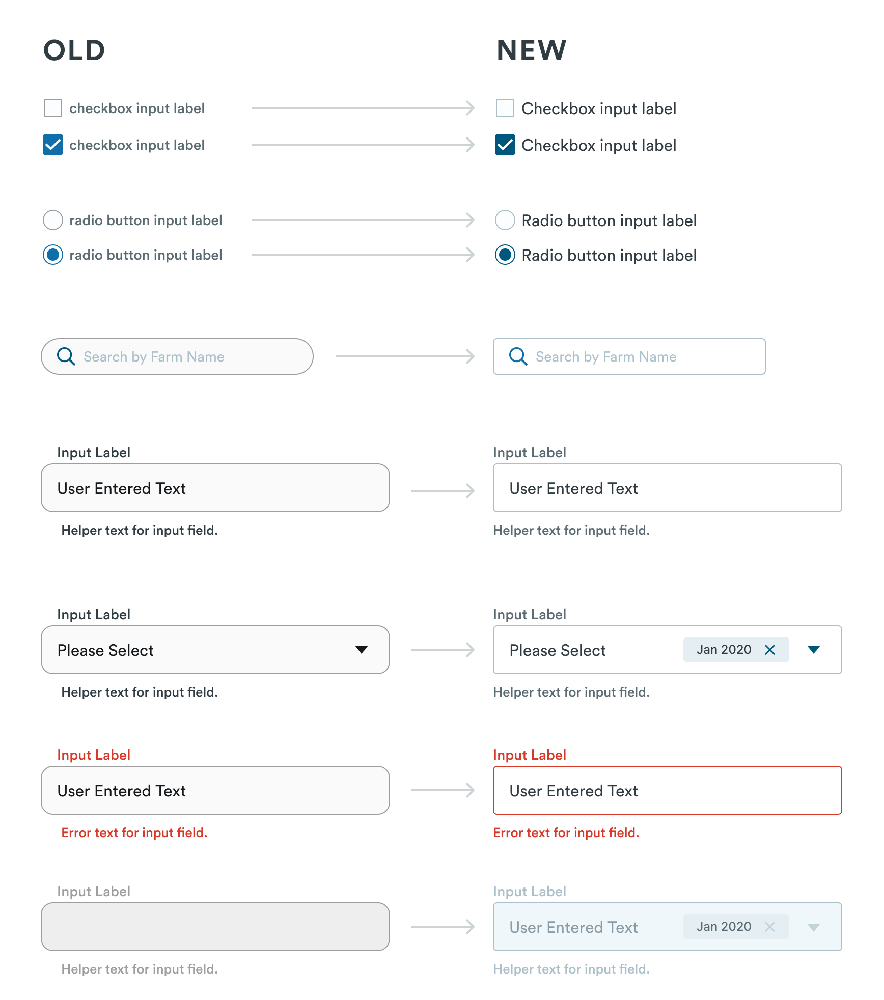
Form Elements
In my interviews with the team I’d heard anecdotes, and observed on customer session recordings, that buttons were often mistaken for tags (and vice versa) due to their similar pill shapes. I updated their shape and applied the colors to each of the different variants.
Tables
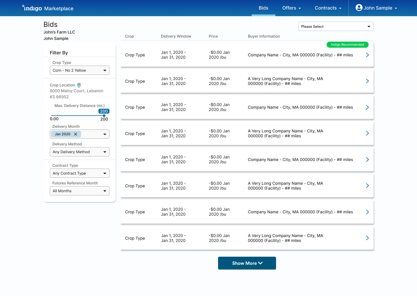
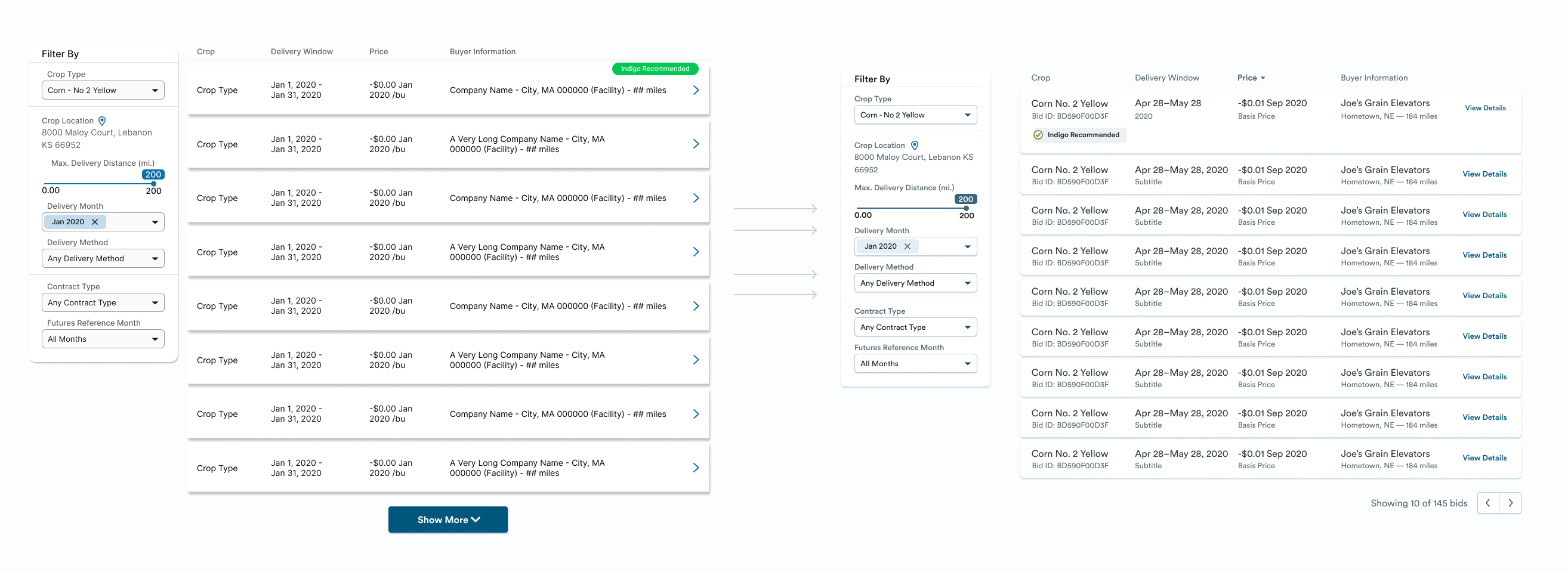
Our products relied heavily on tables for both navigation and tabular data. I had explorations for both tables and the filters around them that were a departure from what was currently in the product, and after getting feedback from product teams and my engineering team, I decided to focus on a reskin that had parity with what was in the product and added a backlog item to revisit tables in the future.
We had seen some LogRocket sessions of users struggling with the pagination pattern we were using. The user could reveal chunks of 20 rows at a time by pressing a button, but the state of this didn’t persist if the user used the back button after viewing an item. We took this opportunity to add a more traditional pagination component.
Page Hiearchy and Navigation
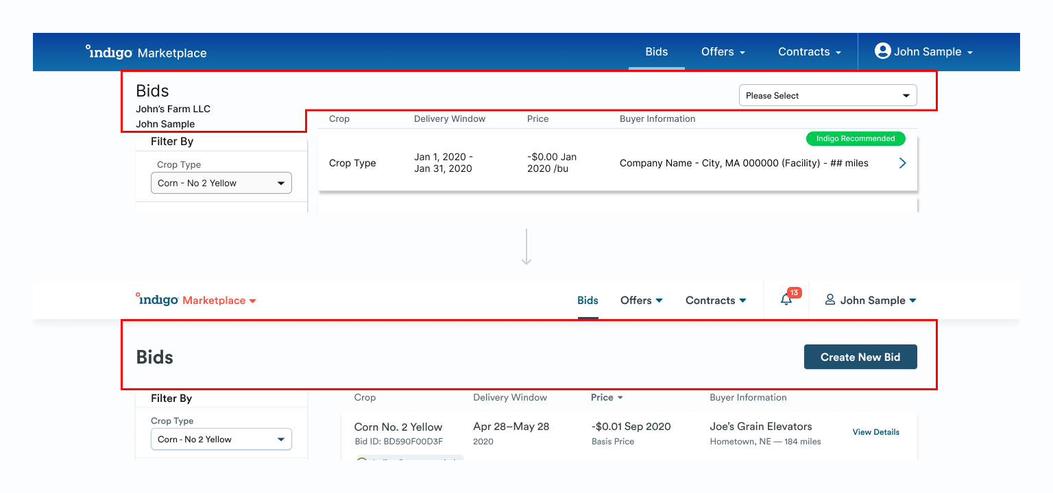
Our top navigation bar used a strong gradient that visually overpowered the content on the page. I reskinned our navigation bar to give content more prominence and help navigation fall into the background, as well as feel like it belongs alongside our web and native navigations.
Each team building a page in our products had a slightly different variation on how the title of the page and any actions was displayed, and as the first piece of content on the page, and one that was intended to help orient the user, it made for a jarring transition between pages. I introduced a standard page header, with options for action buttons and a subtitle, that covered the different combinations in our product.
Testing
We wanted to gather data to validate our new visual direction before rolling it out, but without high enough traffic to get statistically significant results in a split test, there weren’t many options.
Internal stakeholders agreed that the new direction looked modern, fit Indigo’s brand, and made us look like a real business instead of a patched-together startup, but they wanted to confirm that these changes wouldn’t negatively affect the usability of our product.
I partnered with our researcher to set up unmoderated usability tests that compared two key pages in both the old and new styles and measured how long it took participants to complete a couple of tasks. The new design performed marginally better than the old, and despite the low n, the directional data was enough to instill confidence with stakeholders that we could roll out the visual refresh.
Evangelism
During the design exploration, I’d been collecting feedback from the design and engineering teams and iterating based on that feedback. With the full suite of changes laid out, I ran the entire project by the design team for a final design review, highlighting the before and after, the changes to expect from a Figma perspective, and timelines for when this would be rolled out.
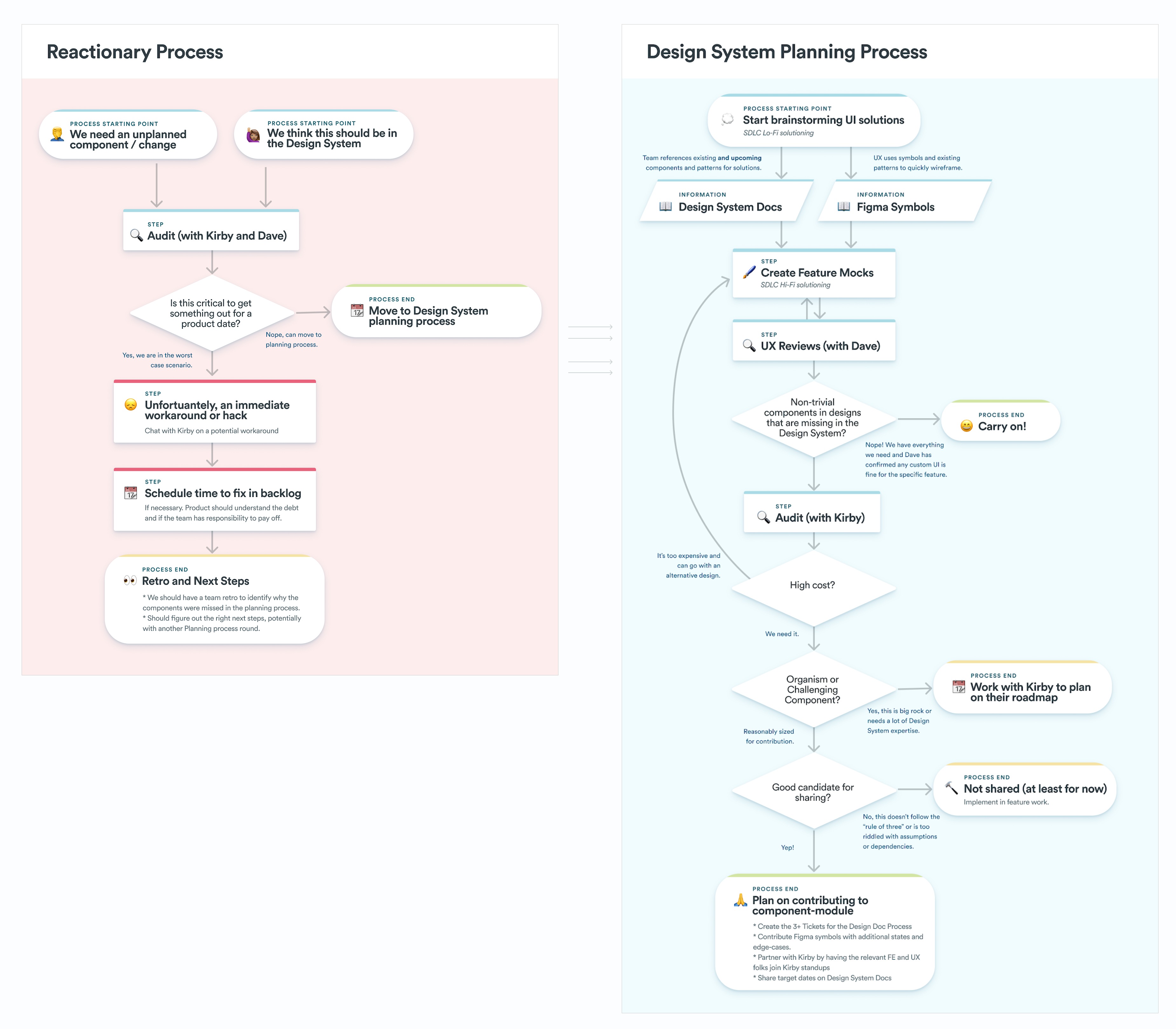
My engineering lead and I delivered a presentation to the full tech team to explain why we were making these changes, how we’d roll them out, what effects it would have, and when to expect changes. We also introduced a new design system process to help gather feedback and triage conflicts that teams encountered along the way.
We set up office hours and invited designers, engineers, and product managers to attend as their teams encountered challenging design system problems. We encouraged teams to reach out directly to the design system team for ad-hoc consulting or pair coding/designing.
Results
After rolling out these changes, our team worked with feature teams to help them adopt the new patterns until we had full coverage across major products. Internally, we received feedback from Marketing that they felt like our products all belonged together, and they quickly replaced all old screenshots on our public website.
We met with our sales team and heard that they loved the new visual direction and felt more confident putting the product in front of farmers, and they’d heard a few positive comments about it from farmers and partners they met with.
Product leadership was also impressed by how cohesive our products felt. Our Chief Product Officer complimented my work, mentioning that we “finally look like a real product”.
Our design system analytics showed that even after my team’s direct consulting work, product teams were adopting the new components and using the new tokens. We monitored the instances of custom styles and noticed a significant reduction in custom styling for type and color.
Challenges and Takeaways
For designers, these changes came via a new Figma library for new components, with an old library for deprecated components. Transition states like this can be really challenging for the team to understand which library to reach for. After observing how confusing this was for designers, I quickly followed up this project with a refactoring of our Figma libraries. A single common library for all colors and icons cascaded down into a web library and a native mobile library. Any other libraries were archived so designers only had to turn on one library.
In hindsight, not having a numerical scale for color proved to be too restrictive. In future iterations my team refactored or color scales to match our grays and have a full set of numbered styles.
We also launched this project with the lowest level of tokens. Because there was ambiguity in when and why to use certain colors or type styles, we started to see inconsistencies in design reviews. Having named semantic styles for color, type, and shadows would have prevented a good portion of this.
