Ditching Spreadsheets
How can we make it easy for catering partners to understand the financial health of their business?
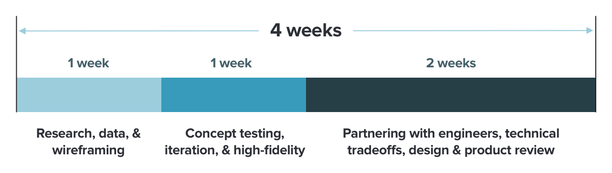
Project Timeline
Context
ezCater is a two-sided marketplace, connecting catering buyers with restaurants.
My team, which included myself, a product manager, and 5 engineers, were tasked with identifying and solving catering partner pain points. One of those pain points was poor visibility into the financial health of their business through ezCater.
The Problem
At the time, the only way catering partners could assess the finanical health of their business was by requesting a spreadsheet of their finanicals through our support team.
We heard in partner interviews and through support data that lack of visibility into the performance of their catering business was a large problem for catering partners, and we aimed to fix that.
By pouring through past research notes, we suspected that:
- The spreadsheet download required that our partners have the technical savviness to manipulate and analyze the data in the spreadsheet
- The different types of data we provided were laden with ezCater jargon that didn’t always align with how partners understood and ran their business.
- And some partners didn’t have the business backgrounds to know what metrics are important or how to act on those changes.
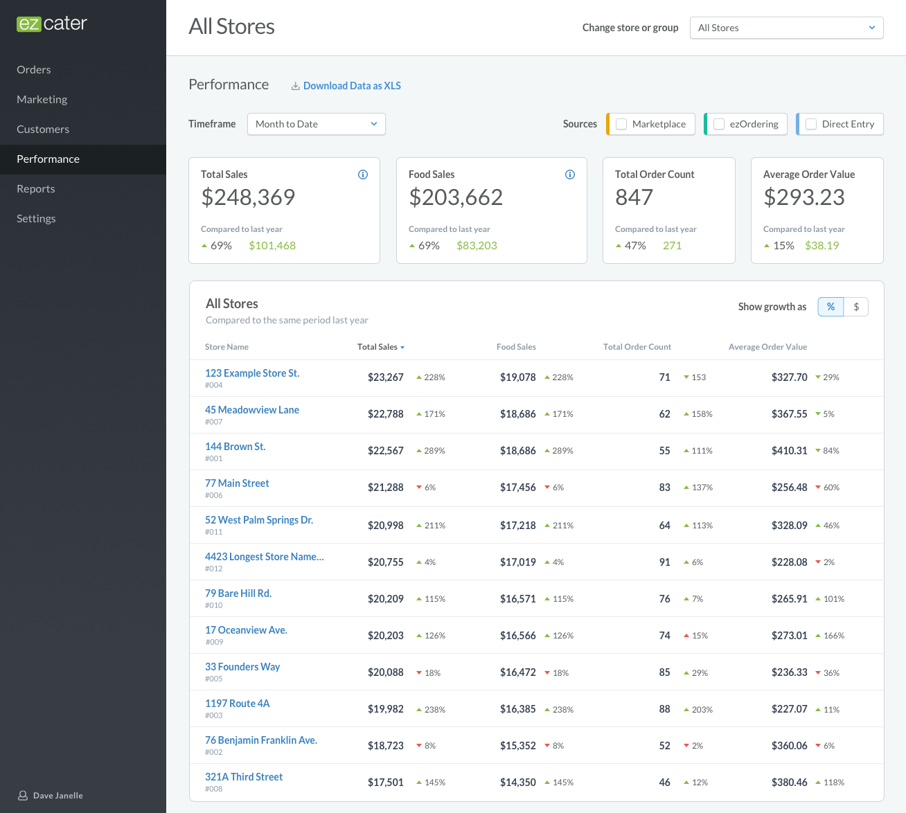
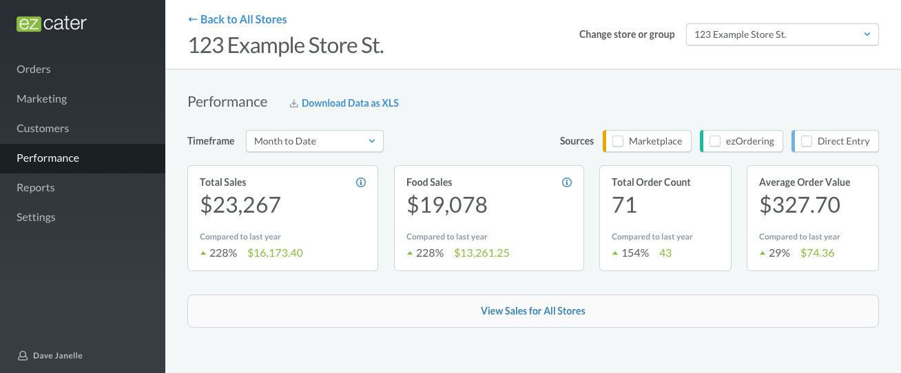
Our goal was to provide a way for partners to see the high-level financial health of their business without requiring them to request a spreadsheet.
Gathering Data
The research we had already was outdated, so we lined up interviews with our partners to better understand:
- What were the metrics that mattered most to business owners and managers of catering programs?
- Across what date ranges did partners want to see these, and what kind of historical data did they look at (year-over-year, quarter-over-quarter, etc.)?
- What do they use those metrics for in the day-to-day? How did it affect strategy?
- Who else in their organizations needed to see this data?
- When and how did they react when those metrics changed?
At the same time, I scoured data from our support team, looking for any mentions of partners contacting us about payments, questions about their catering program’s financial health, or ways to optimize their account (we assumed that may speak to how they react to changes in metrics).
I also watched FullStory sessions of the existing reporting feature, seeing how it was used and how people saved their reports. Since they had to name their reports and download them after they were generated, we had data in our warehouse about how they named them, and an engineer pulled that for me.
Concept Testing
Based on what we learned from interviews and the gathered data, I wireframed multiple concepts. We identified four key metrics that were commonly sought by our partners, and wanted to make sure they could be seen and understood at a glance. We assumed partners would need to see all of the stores they controlled, as well as specific history of a single store’s performance.
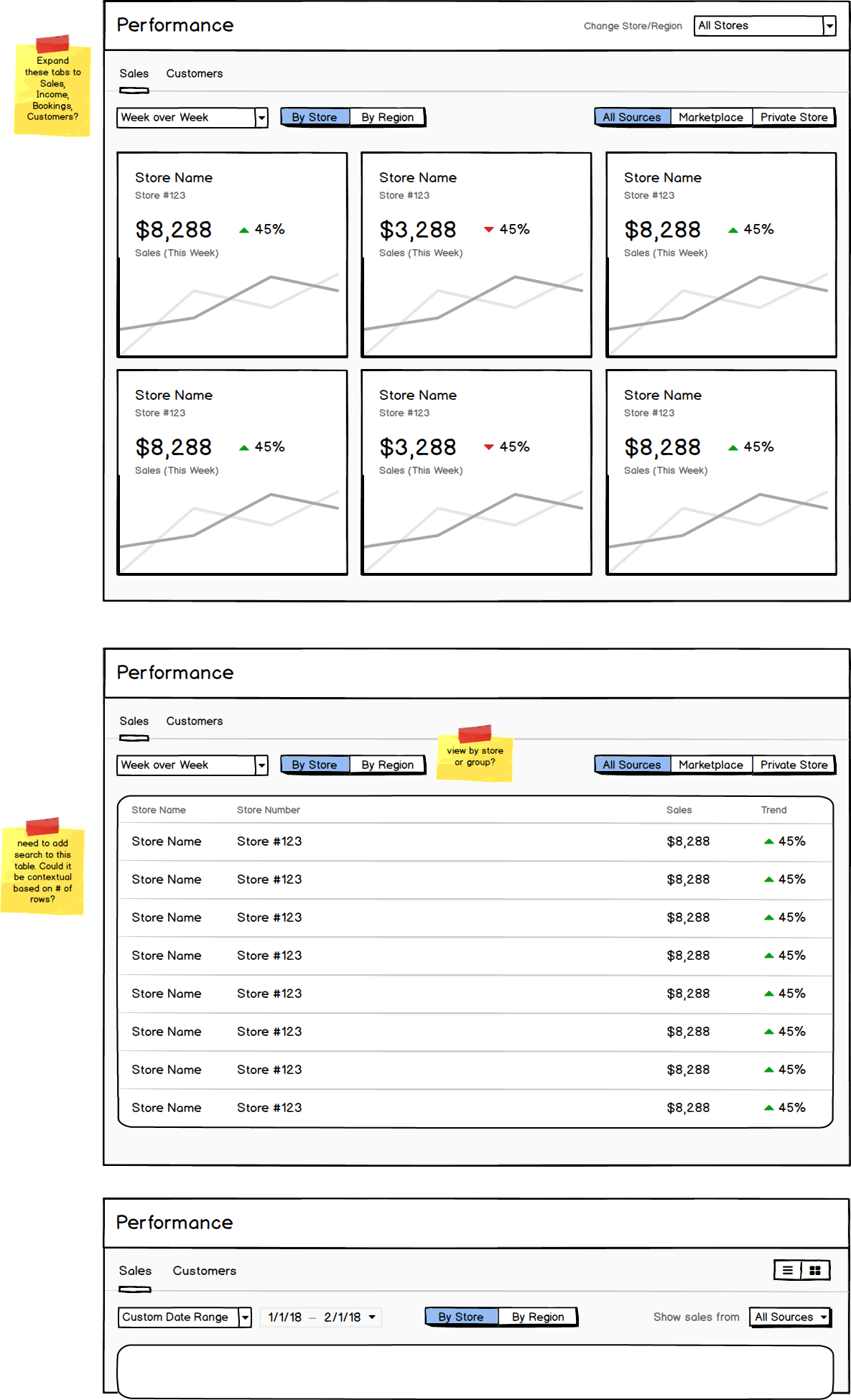
I quickly iterated on these with PM to get our best version together, and we set up usability sessions with partners. We discovered that, while we were on the right track, all of the partners we interviewed compared stores to others in their region, so we iterated to make this easier to do and understand.
Pruning Scope & High Fidelity
With a fairly high level of confidence that this would be a version that would be worth launching and learning, we brought in our engineers to vet the technical feasibility of the various pieces of the project.
We didn’t have any graphs or charts in the product yet, and the engineers did a spike to determine if we should build our own, use an off the shelf react-friendly plugin, or iframe something onto the page to get this to market (and learning) quicker.
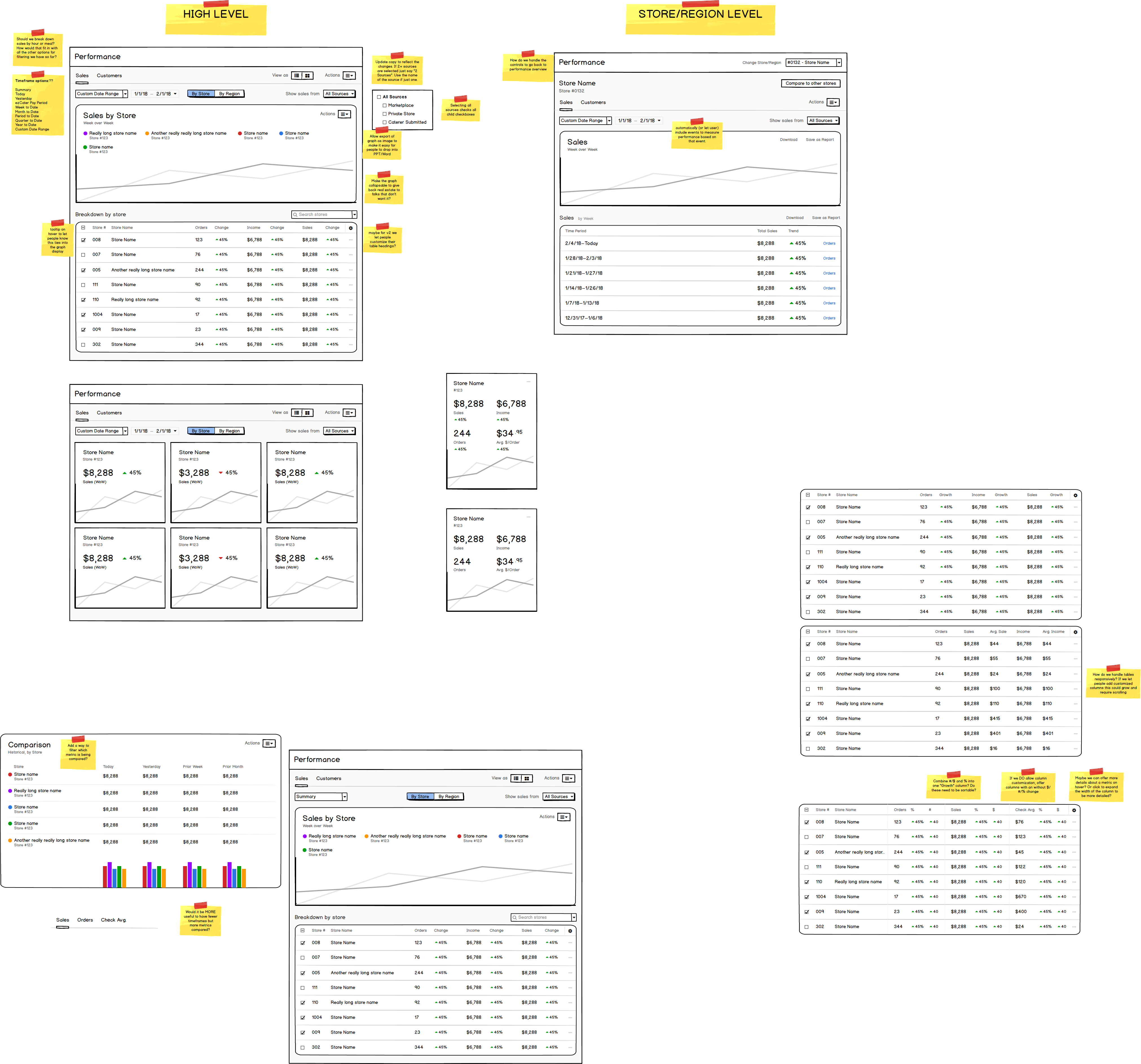
Based on their findings, the team decided to cut the graphs due to the technical and financial constraints. In their place we added data wells to provide a high level overview of the key metrics and their change based on the selected time period.
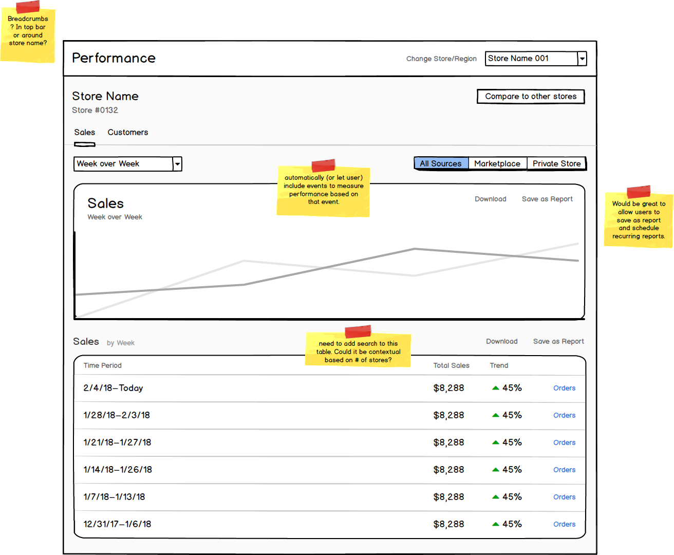
I created high-fidelity mockups and the engineers began to build the new dashboard.
Throughout the development process, I paired with engineers to make interaction tweaks as technical constraints arose, and helped troubleshoot CSS quirks to get final designs to the appropriate level of quality.
Results, Challenges, and Learnings
After launching, we received feedback from partners that they “loved it” and it “made their job easier”. While we had built a feature that solved a problem and that our partners enjoyed, the real success of this project came from what we learned about ezCater’s business strategy.
Our product was only capturing a very small percentage of a restaurant partner’s total business. Any data we could provide about the financial health of their catering business was still only a sliver of the total picture of a restaurant’s financial health, making it harder for restaurants to fully engage with ezCater.
This prompted ezCater to revise their business strategy and invest in new teams and solutions that could capture the totality of a restaurant’s business and provide more incentive for restaurants to adopt ezCater.