Messaging Spectrum
What patterns do designers need to fight users’ banner blindness?
Context
During design reviews and in consulting sessions at Indigo, I noticed that designers struggled when trying to call attention to important messages in their designs, especially messages that required immediate attention. I recognized that there was a gap in our design system as it related to messages to users and user feedback.
Problem
Indigo’s design system had only few patterns that designers could reach for to provide feedback to the user. This caused two problems:
- Designers were creating their own versions of “middle ground” notifications leading to inconsistencies across the product and a lack of accessibility.
- When designers used the patterns available to them, the patterns were too noticeable and used too frequently. Users suffered from “banner blindness” and ignored them.
Goals
- Fill the gaps in the spectrum of feedback patterns available to designers.
- Make those patterns meet WCAG AA standards for accessibility.
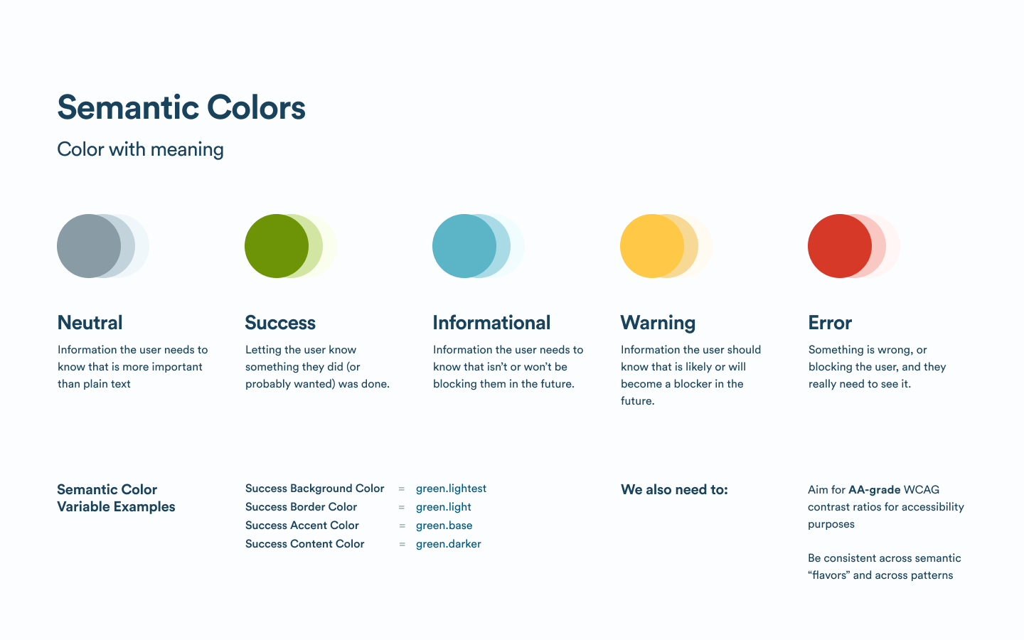
- Establish and implement semantic colors for key concepts.
Landscape
I scoured all of our products to understand how designers were messaging the user and explored upcoming design work to see if I could find any common patterns. Designers did not have a lot of options to convey importance to users.
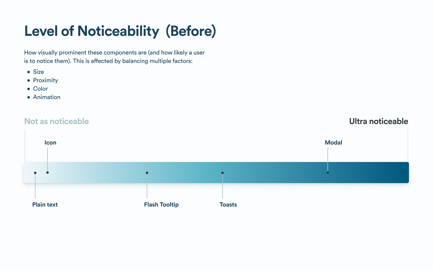
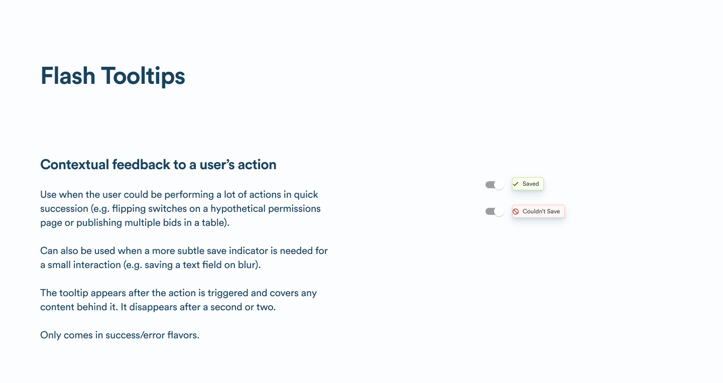
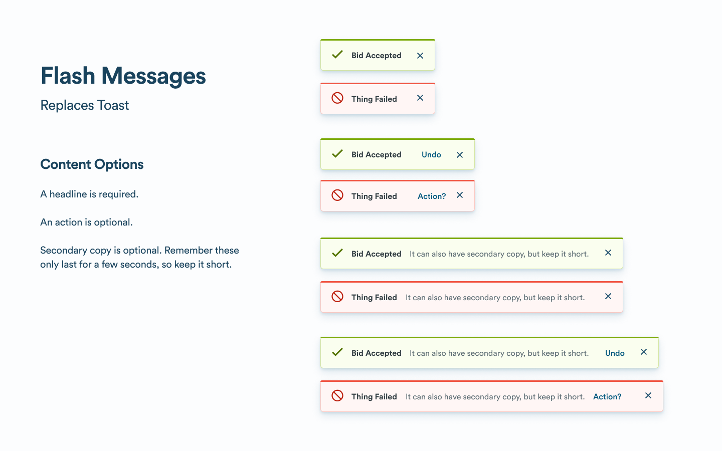
Teams had a Toast pattern that came in a couple of variations that they typically used for most notifications.
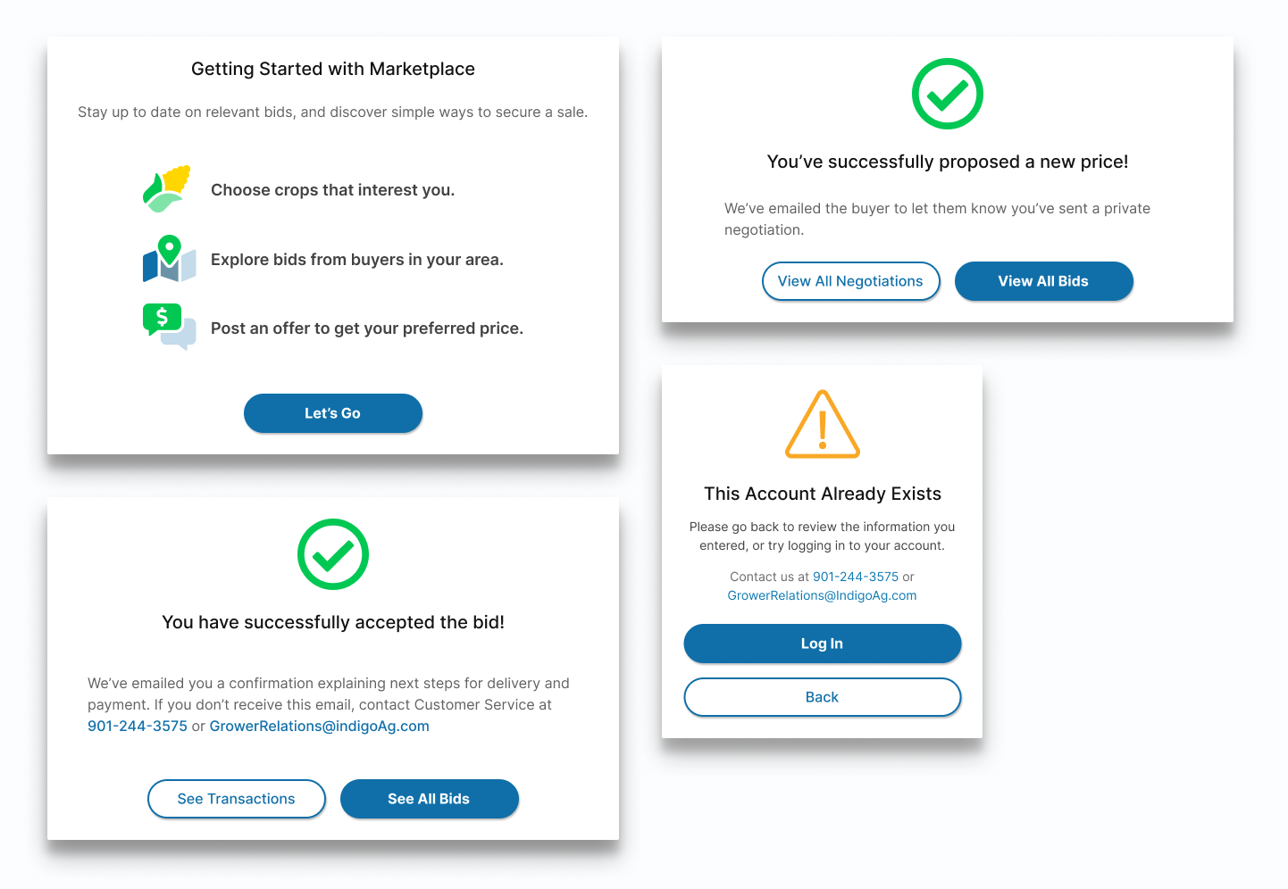
For stronger messages, teams would interrupt the user with a Modal, and the content inside these modals was custom-designed each time a designer reached for the pattern.
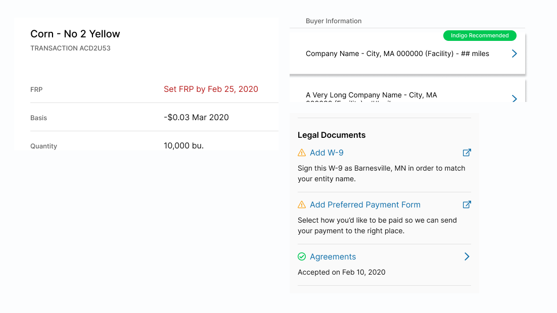
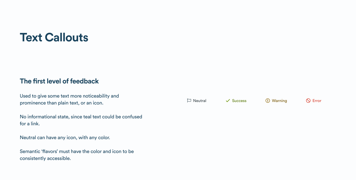
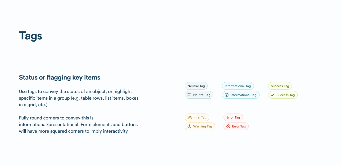
Other than that, teams relied on custom Tags, or used colored text and icons to call attention to less important messages.
Designing for Noticeability
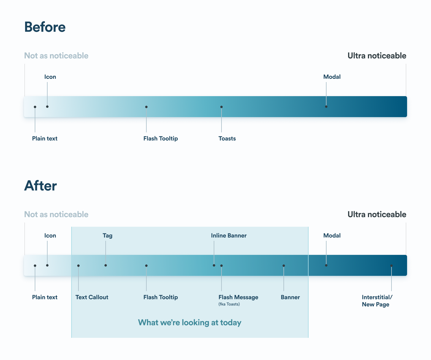
To identify the gaps, I mapped existing components on a spectrum of “noticeability”.
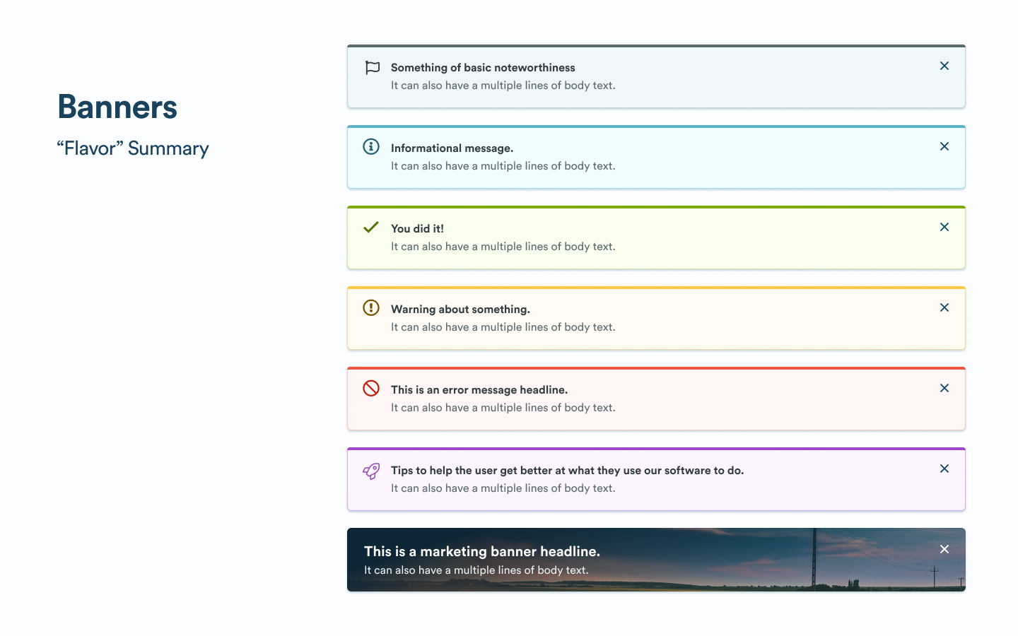
Since color was one dimension of noticeability, and has meaning tied to it, I defined what each color would mean, our first set of semantic variables.
As I explored individual components, I tested color contrast for accessibility purposes and ensured meaning would be conveyed with some other method besides color.
New Components
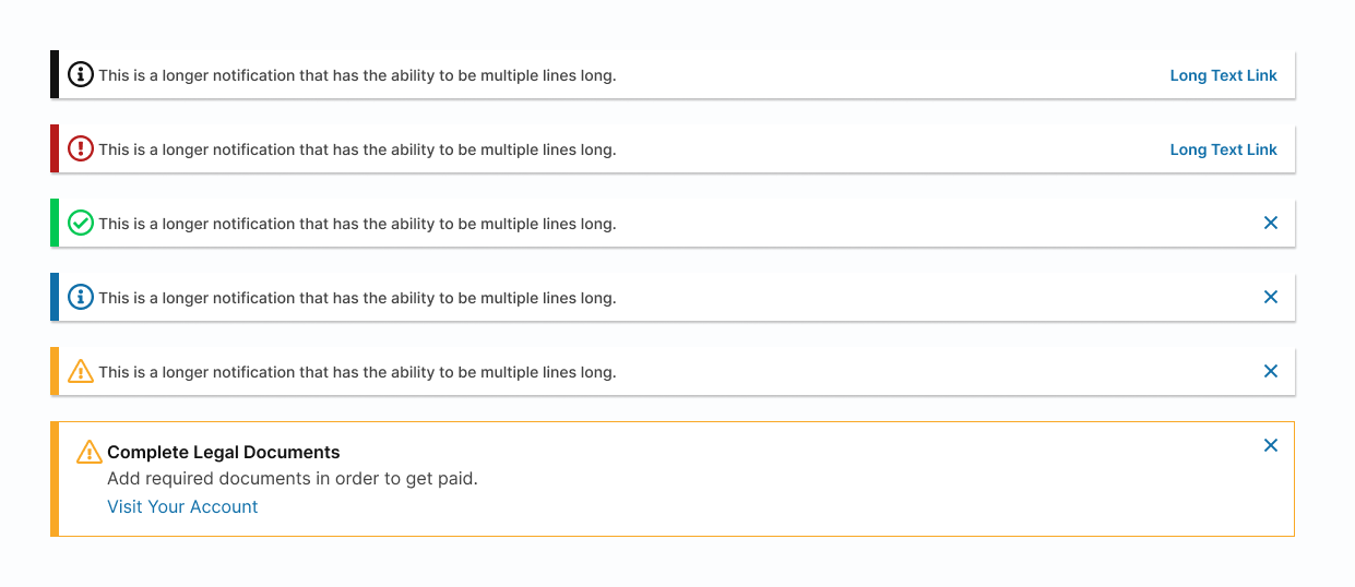
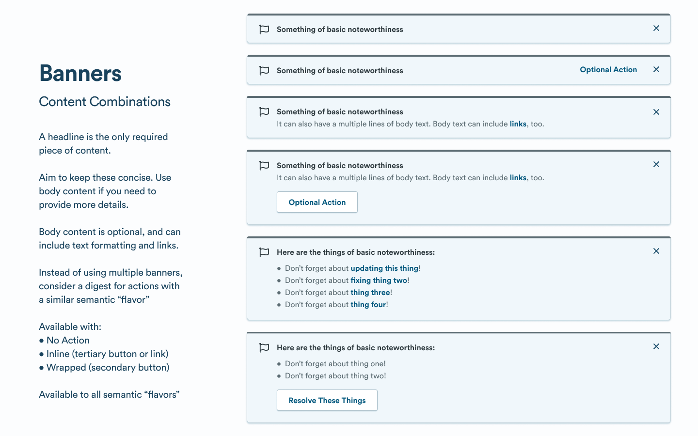
With the core concepts in place, I tackled the design and guidance for each individual component. For each component I audited how other design systems have solved that problem, explored multiple directions for how it could work for Indigo, and narrowed and refined the designs through multiple design review sessions.
I mapped each of our new components to the spectrum. Satisfied that we had enough granularity to give designers some flexibility, I took the work to design review and presented it to the team.
Evangelizing the Design System
To roll out these components effectively, I needed to help designers understand how to better use existing and new components to meet their needs.
As an introvert and quiet leader, I can struggle with making sure my message is heard. To evangelize the new components of the Design System, I used multiple outlets that played to my strengths.
- I gave a large presentation to the design team introducing the components.
- I emphasized the new patterns and how to use them in design review
- I recorded a video walk through of the new components for people to reference asynchronously
- I provided gentle reminders of missed usage opportunities to designers during consultations.
After adjusting designs based on the design team’s feedback, I worked with my engineers to build each component. Flash messages were a replacement for our existing toast component, so we audited our code base and helped teams replace each instance with flash messages. The rest of our components were new, and we could roll out without disrupting feature teams.
Results
Within a few weeks of components being available to designers and engineers, we started seeing teams adopting them.
We added guidance for how and when to use these patterns in the Figma library and on our documentation site. I later realized that designers typically grab components from the Assets panel in Figma and dove right into using it. In future components, we put guidance directly into the content of the component so designers always see some guidance when they drop it into their files.
Takeaways
Finding a way to measure patterns that require this level of nuance to use effectively makes it much easier for designers to understand when to use them. In future components, I tried to be exceptionally clear when and why to use them, with decision trees or some mental model for people to follow.
This project had me filling gaps with patterns we needed immediately and patterns that I imagined we would need soon, so we designed and built robust variations of each component. I’ve since learned that it’s better to still envision where components need to be flexible and plan for that flexibility, but only roll out the portions teams need right away (and ideally encourage those teams to contribute the additions they need directly).
